Version 1
Problem solution is last in the visual hierarchy
Unnecessary features for an MPV
Arriving bus info lost in hierarchy
Color use not effective
A mobile app focused on using public transportation in a major city.
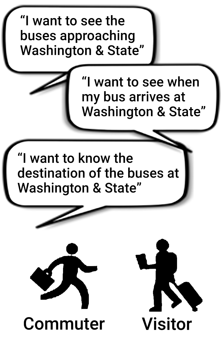
The major problem needing to be solved was identifying the next arriving bus and how much time a rider had to get there. Riders were complaining most about the Washington & State bus stop.
My Roles
UX Research, Visual Design, Prototyping
4.6 / 5 stars
Leverages the “Metro” name
Popular D.C. area transportation app
Requires network access
Screens are text heavy
Website is virtually useless
App use is not instantly intuitive
Free version has ads
Visually robust
Integrate social media with app
Integrated in WMATA marketing
Standalone apps with data available
Users from other cities using competitive apps
Electronic passes available on other
transportation apps
Intuitive, feature-rich screens
Multiple options for transportation modes
Detailed info such as current location, time to nearest stop, routes, destinations
Elegant Apple Watch integration
4.4 / 5 stars
Loading speed not as fast as others
Focus is more on European market
Tourist destinations worldwide
Rich screen design built around maps
Highly acclaimed app - unique marketing opportunity
80% of sites load faster
Local commuters using other transportation apps
Lots of nice to have options not necessary in an MVP
Still unnecessary features and not focused on Washington & State bus stop
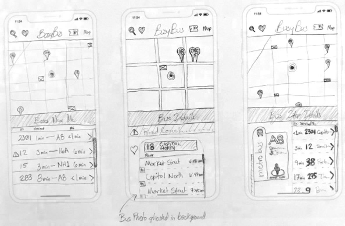
More focused on problem bus stop but still includes additional info and layout is tight
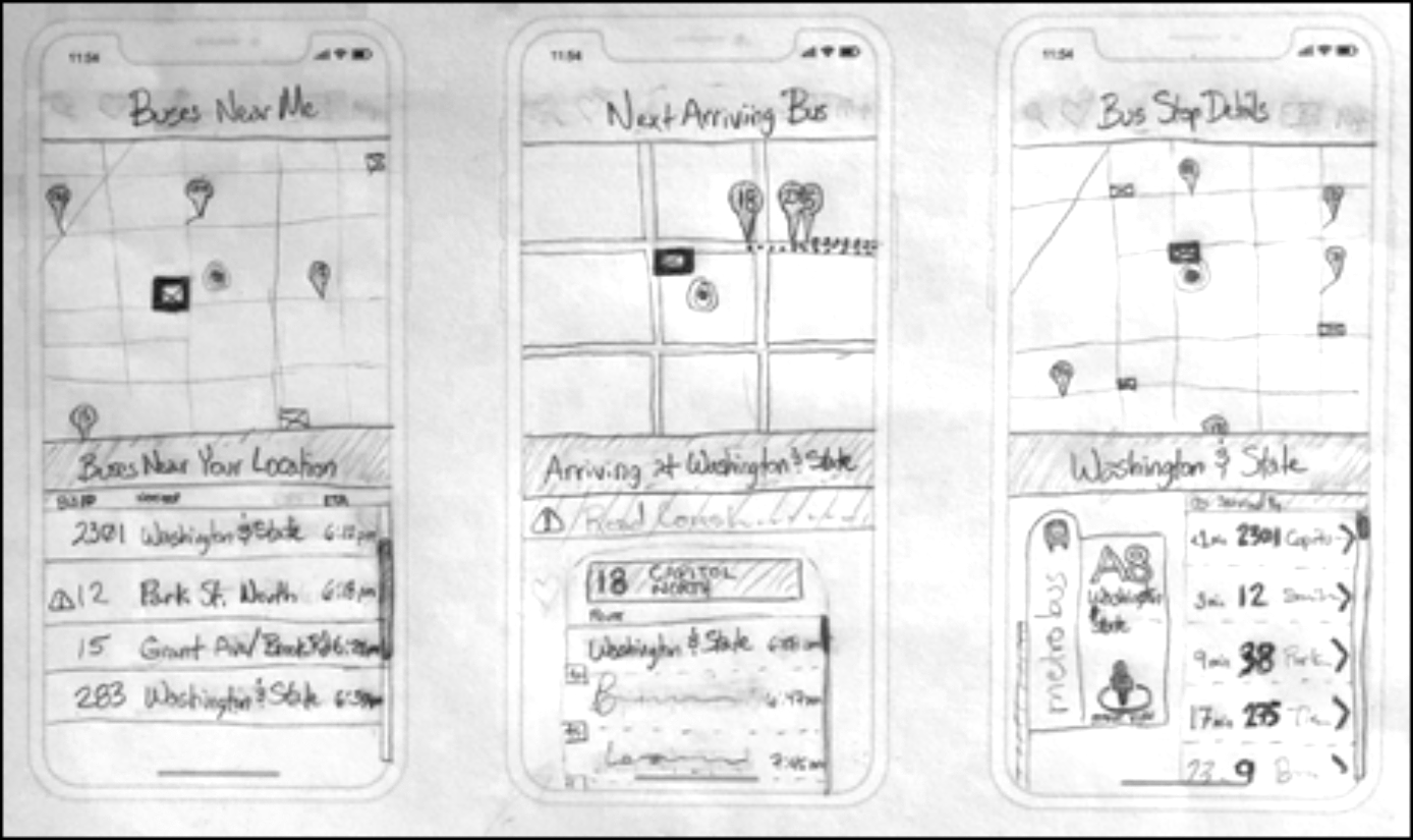
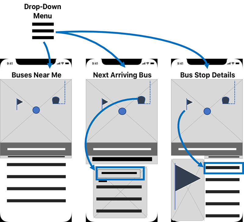
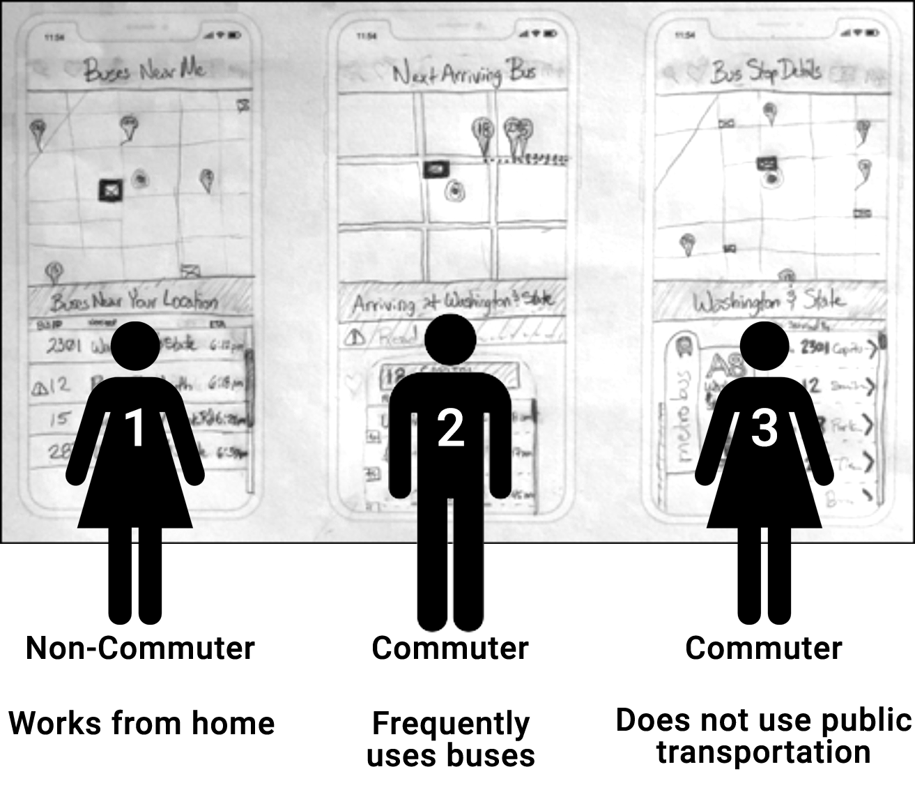
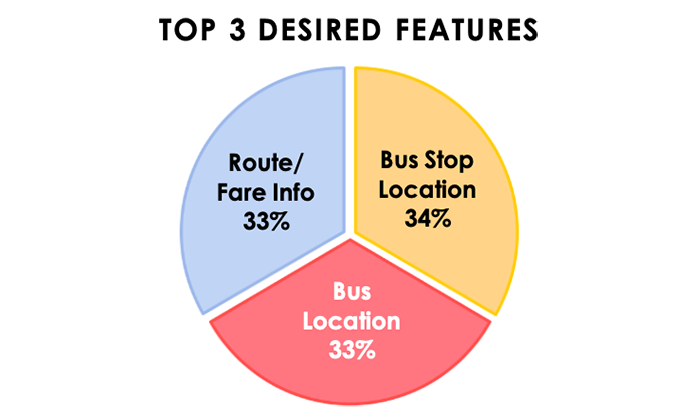
Find buses near their current location
Find details about a specific bus
Find details about a specific bus stop
